Women's History Month Poster
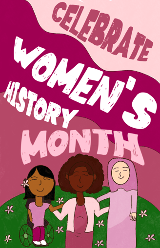
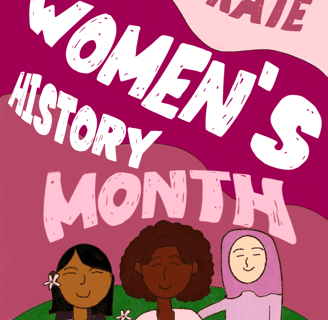
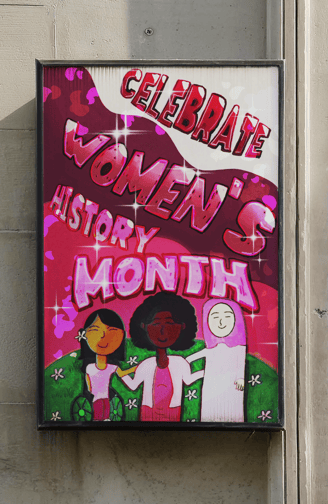
Client needed a poster for Women's History Month that had a diverse amount of women. This was my first draft of the poster. I went with mostly pink and purple since those are colors primarily used in women's history month posters. I wanted to focus more on typography so I made the words take up most of the poster.
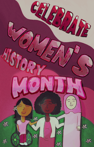
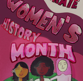
This was my second draft of the poster. I wanted to make the words less two dimensional so I added some shadows and highlights. I also added shadows to the women so they wouldn't blend into the background too much.
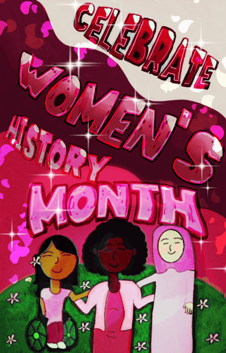
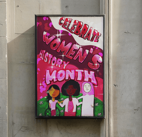
This was my finalized poster. I wanted to add effects because the second draft still felt flat to me. I made it more saturated to enrich the colors of the words more. I also added petals because I feel like flowers are normally something you give to the women in your life to celebrate them. Lastly, I added a bling effect for a finishing touch to emphasize how women shine.


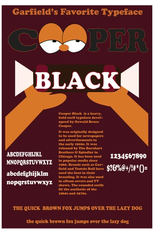
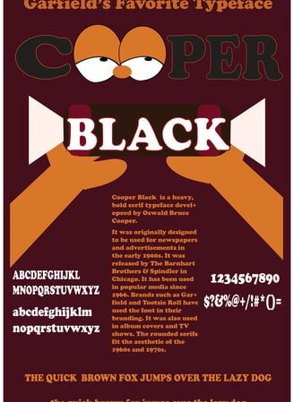
I designed a poster emphasizing the look and history of a typeface. I chose Cooper Black because of its serious yet nostalgic look. I wanted to incorporate Brands that use the font such as Tootsie roll and Garfield in order to make the connection between the font and the brands in the viewer's head.
Typeface Poster
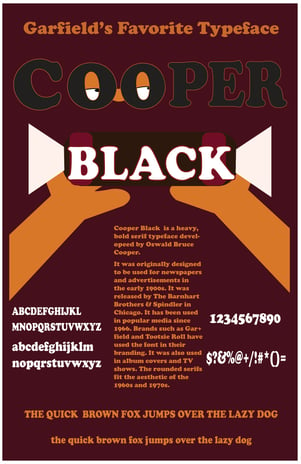
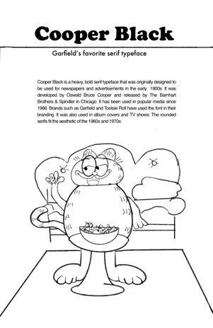
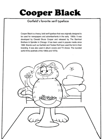
This is my first sketch of the poster. I wanted it to have a lighthearted comedic tone to it so I made Garfield the center of the poster. I made him eat the Tootsie Rolls because in the show, he is a foodie.
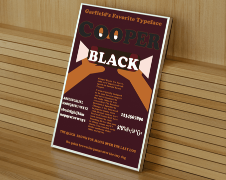
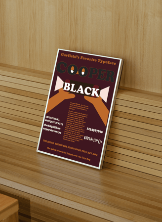
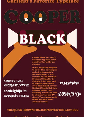
This was my first draft of my poster. I decided to emphasize Garfield less because I didn't want to distract from the point of the poster which was to explain the typeface. I still wanted to incorporate Tootsie Rolls so I made it the background behind black.
This was my finalized version of the poster. I decided to emphasize Garfield less by putting him behind Cooper to show Cooper Black is the focus. I didn't want people to think it's a Garfield poster and ignore the typeface and its history. The poster was meant to be educational so I revised it with that in mind.
Promotional Graphics


Client needed an instagram post to promote getting a flu shot for flu season. These colors were a part of the brand guideline I was given. I did the illustrations in Adobe Illustrator. I wanted to do a zigzag of the words to provide complexity since I had to stick to the layout I was given.
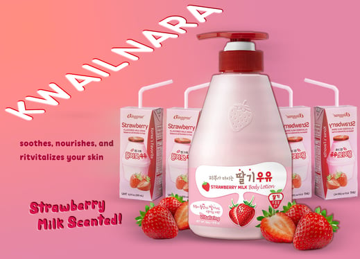
This was a promotional graphic meant to promote Kwailnara new body lotion. Kwailnara is a Korean based skincare brand that wants to appeal to a more western demographic so I helped designed a graphic that will aid them in that goal.
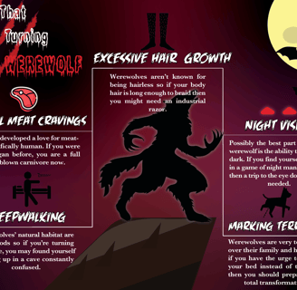
Infographic
Logo Design
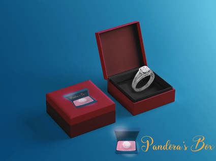
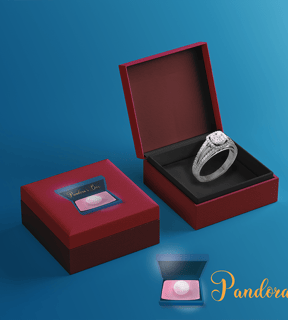
Box Mockup
Pandora's Box is a sub-brand of Pandora that caters to female tweens and teens. The primary colors of the brand are pink, blue, and gold to contrast Pandora's primary colors of black and white.
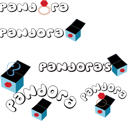
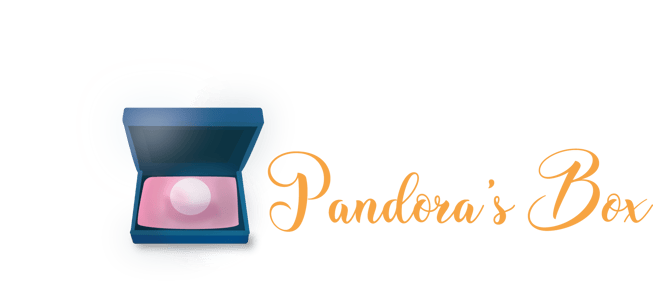
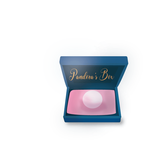
This is my finalized logo. I decided to make the box blue to complement the pink pillow inside. A huge problem I was having was choosing which jewelry to put inside the box. I went with one pearl so I could make the box smaller but still have jewelry that fit inside the box.
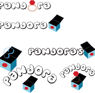
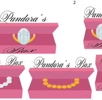
These were my first drafts for the logo. Brands like PINK, Justice, and Claire's were my inspirations. I really liked the idea of there being something inside the box so I tried to see what could be a good fit. I was really aiming for the perfect girly look.
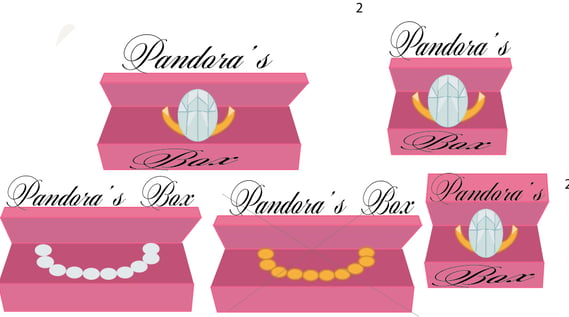
These were my second drafts. I wanted to see how the box would look if it's pink. I received feedback about how my first drafts were too childish so I wanted to make some that were more elegant but still very girly. I also tried to see if changing the color of the jewelry would enhance the logo.
Branding & Packaging
Software: Adobe Illustrator & Adobe Photoshop
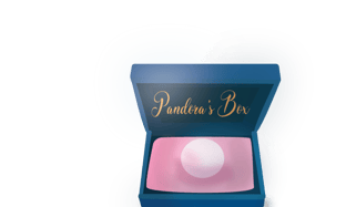
This is another finalized logo that I made to go on shopping bags and advertisements. The other logo would be more suited towards packaging on the jewelry boxes.
